 Stach LTD
Tesco: Digital Design Language (DDL)
The Problem
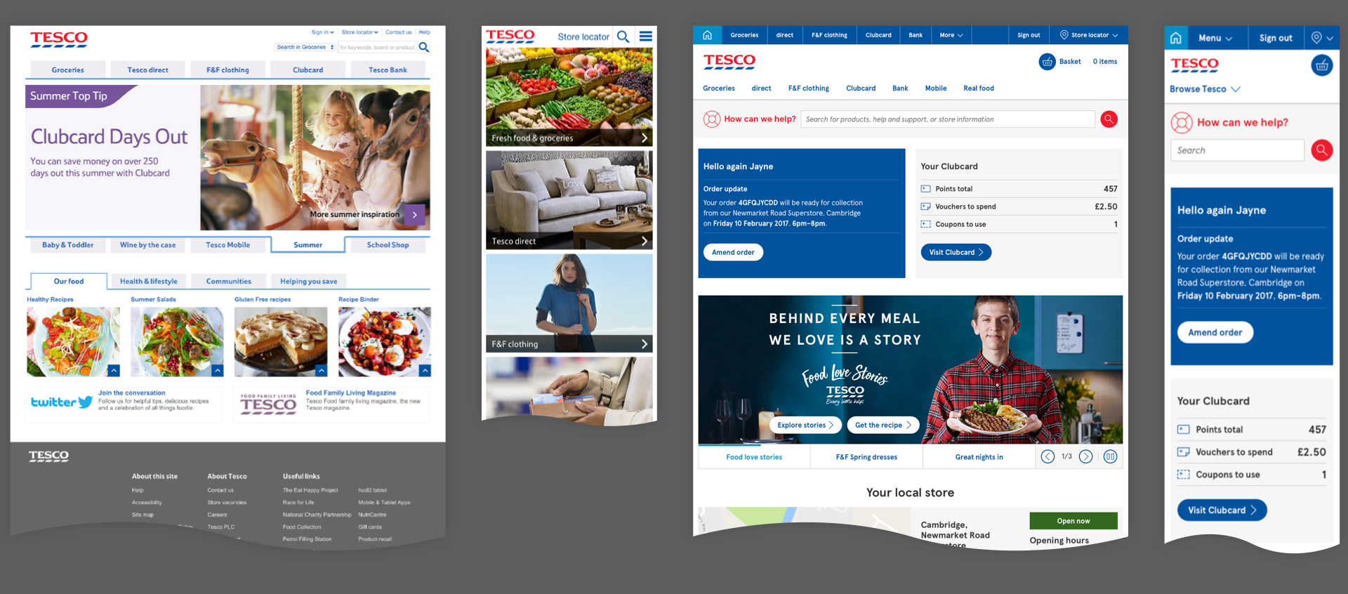 Tesco lacked a coherent look and feel for its digital estate which was contributing to decreasing trust in the brand, and confusion among existing and prospect customers.
What we did
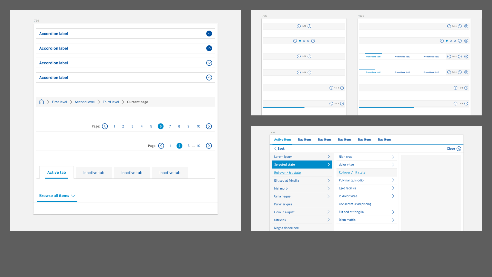
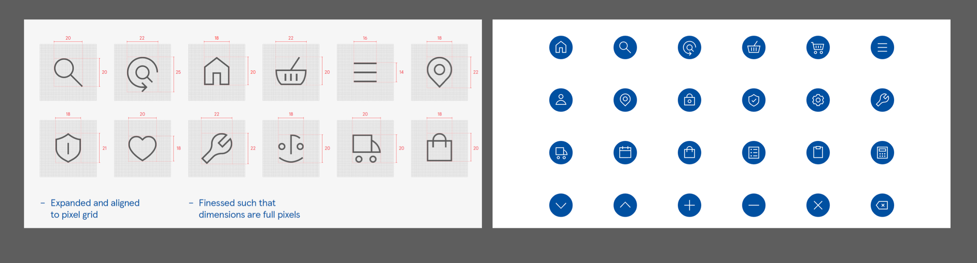 I created the team who defined and created a shared design standard for user interfaces across all Tesco-branded screens: consumer-, colleague- and partner-facing. This included sub-brands and global properties. This was then developed further to become a central set of UI components that all teams could use to build with.
How we did it
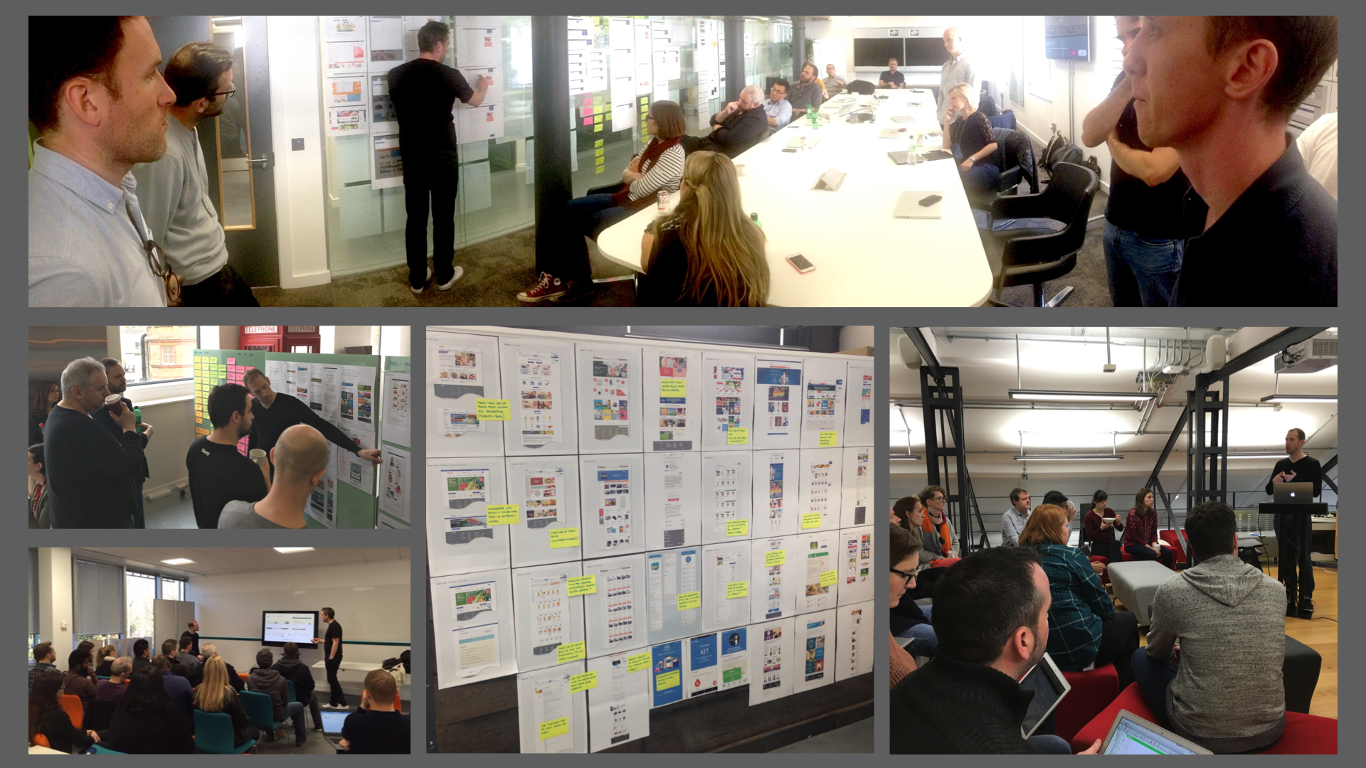 Rather than create yet another team who would create a specification that was ignored, I built a small central team who asked other teams to second designers into to help build the design language. This ensured that teams were able to influence and shape the work with their domain expertise and then return to their teams as advocates.
We were highly-transparent with regard to our timings and roadmap, which enables contributing and consuming teams to plan their work accordingly. A smiple governing principle (later ‘blessed’ by Brand) was that wherever a UI specification exists in the DDL it must be used.
Files
Full DDL presentation deck - 46MB
Links
DDL Specification (u/p: view/1Tesc0)
Related blog posts
- Digital Design Language phases and why we have an iterative design process
- Making Tesco’s websites more helpful by design
- Design systems, brand and identity
product design web product strategy accessibility tesco UI design systems caseStudy